
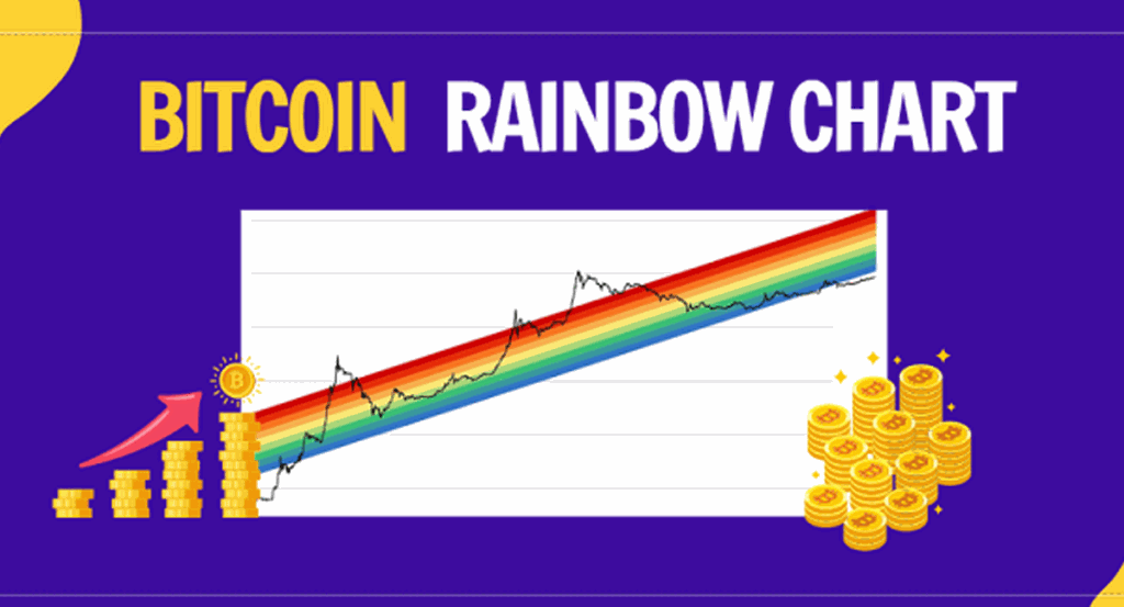
Bitcoin Rainbow Chart has proven to be one of the effective methods to measure market changes, data, and long-term price movements of Bitcoin to help us make the right investment decisions.
Since its first appearance, Bitcoin has experienced incredible growth and is known as a volatile asset with high returns and potential, leading to many investors. BTC increases year by year. With that development came a lot of tools that have come out to gauge the price direction of Bitcoin.
Despite the fact that we cannot rely on a scientifically proven method to buy or sell Bitcoin, there are several ways to better understand its volatility which can help us make informed decisions and wise investment decisions using the Bitcoin Rainbow Chart is one of the methods that we can consider.
What is Bitcoin Rainbow Chart?
Bitcoin Rainbow Chart is a charting tool that helps predict Bitcoin price, combining Logarithmic Regression (logarithmic growth curve) and 9 bands of rainbow colors.
With 9 rainbow bands overlaying the logarithmic growth curve, this chart highlights the market sentiment at each of the different price periods. From there, it suggests potential opportunities to buy, sell, or hold Bitcoin.
The color of the lower limit of the rainbow is blue, indicating that the price of Bitcoin is falling, while red is its upper limit, which means that its price is increasing.
The Rainbow Chart is a long-term pricing tool for Bitcoin that provides a perspective on an investor’s Bitcoin buying or selling strategy based on prominent market sentiment at each rainbow color period.

What do the Bitcoin Rainbow Chart color bands represent?
This price chart breaks down into 9 colors based on the rainbow, each representing the following:
- Blue: Area where you can stock up because this is when the price drops sharply; just choose a price point that works for you.
- Light Blue: This zone shows that this is where Bitcoin is undervalued and has potential for future growth.
- Green: This is when Bitcoin is priced stably and is expected to move a lot, a good time to accumulate and hold Bitcoin.
- Light Green: A time when Bitcoin is overvalued, but there may still be growth in the future.
- Yellow: HODL! Time to stay neutral, hold Bitcoin, and do nothing.
- Light Orange: This is when the market is starting to heat up. Investors should research carefully before participating.
- Dark Orange: New entrants suffer from FOMO (fear of missing out). It is not recommended to trade Bitcoin at this time, as the price fluctuates greatly.
- Red: Investors should convert Bitcoin to another asset. Bitcoin is currently overvalued. Bitcoin, at this point, should not be bought.
- Bold Red: This is when Bitcoin is overvalued. Bitcoin, at this point, is definitely not a buy.
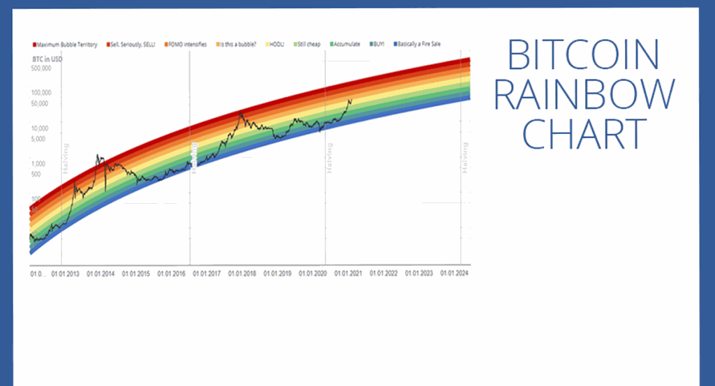
Interestingly, since 2011 the price of BTC has never gone below the blue line at the bottom of the rainbow.
How did Bitcoin Rainbow Chart evolve?
This chart was created by a Reddit user nicknamed “Azop” for the first time in 2014. The chart was originally created for the simple purpose of entertainment and to show the Bitcoin value trend of people. previous year. However, this chart has amazing accuracy, along with the application of the color of the rainbow band, so it has been called the “Bitcoin Rainbow Chart”.
Since Bitcoin’s daily volatility is not included in the Bitcoin Rainbow Chart, this chart is used for long-term investment planning and not day-to-day transactions.
This method has been around for a long time and is used by many people because of its simplicity. The chart will highlight the market sentiment shown at each different price period. From there, investors find potential opportunities to trade or hold Bitcoin. This is one of the effective methods to capture the long-term future of Bitcoin.
Advantages and Disadvantages of Rainbow Charts
Advantages
- Since its launch, the rainbow chart has always kept its accuracy.
- Logarithmic regression models are quite useful when we invest in relatively volatile assets.
- The rainbow chart is easier to understand even for a novice.
Defect
- The chart only shows the long-term price trend.
- The rainbow chart has been accurate since its launch, but in the future, it could be wrong without warning.
- More time is needed to prove the accuracy.
Should rainbow charts be used to identify trends?
Although since its launch, the Bitcoin rainbow chart has proven itself to be an effective indicator of market changes and volatility through the chart, it is not an indicator of the future Bitcoin price.

A rainbow chart may not be the only thing we use to make our future investment decisions, but the information we gain from looking at long-term price movements can help us better understand the volatility of a particular cryptocurrency.
Bottom line:
When we understand market cycles and master, the use of indicators can help people make the right investment decisions for themselves. The Rainbow chart can be a great tool for anyone to identify reasonable buy and sell zones, but we should still use other indicators and sources of information to combine and make judgments. If you choose the Bitcoin Rainbow Chart for investment, make sure it is not the only tool and do not rely too much on it.
In the next posts, I will give you some other indicators for you to refer to! Hopefully, the article of BTAguru will help everyone get more useful information, and don’t forget to continue to follow the next articles of BTAguru! Good luck with your investment.